King Rabbit Games
King Rabbit is a cross-platform video game series about solving puzzles, building levels, racing, and collecting items. Over several years and countless iterations, the UI evolved to enhance user engagement and drive business success.
3,000,000+
Downloads
17,000,000+
Sessions
4.7
Average Review
Roles: PC and mobile UI/UX design, visual design, animation, design strategy, user research, prototyping, usability testing
Defining Core Goals
As the mobile gaming landscape evolved, so did King Rabbit. The introduction of new features and monetization strategies required a comprehensive UI overhaul. The primary objective was to ensure users could navigate the game effortlessly and achieve their goals with minimal friction. The UI needed to enhance immersion and maintain the core game experience while integrating key business goals such as user acquisition, retention, and monetization.
The challenge was to redesign the UI to align user experience with business objectives, creating a seamless balance between player satisfaction and revenue generation.
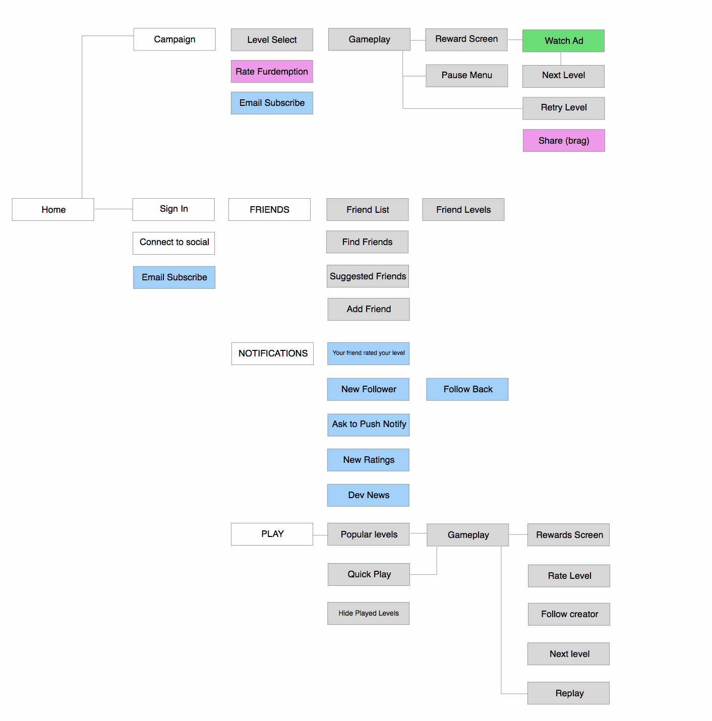
Guiding Principles
Discoverability: King Rabbit offers a wide range of features, and we aimed to make it easy for players to explore every aspect of the game without feeling constrained by the UI.
Continuity: Players should be able to accomplish their goals, like switching character skins or tweaking settings, even during gameplay. Maintaining progress between sessions helps minimize reorientation and keeps players engaged.
Scalability: With plans to add more features, the design needed to accommodate future expansions without extensive rework. Cross-platform consistency was essential to maximize reusability and save development time.
Gather and synthesize insights
The design was influenced by extensive research into game design, player psychology, mobile game monetization, and business practices. Insights from previous iterations of King Rabbit also played a crucial role.
Social Value and Habits: Players form stronger community bonds when they feel they contribute value. They are more likely to share achievements when they feel proud or offer something valuable. Habits are shaped through the cycle of Trigger > Action > Variable Reward > Investment.
Profile Investment: Players stay engaged longer when they feel invested in their profiles. Showing progression through levels, items, or achievements increases the perceived value of their account.
Timing is Key: Interrupting users with ads or offers at inappropriate moments can harm their experience and reduce retention. Ads should be placed where they fit naturally in the user flow, ideally during high points in their journey.
Onboarding Flow and User Testing
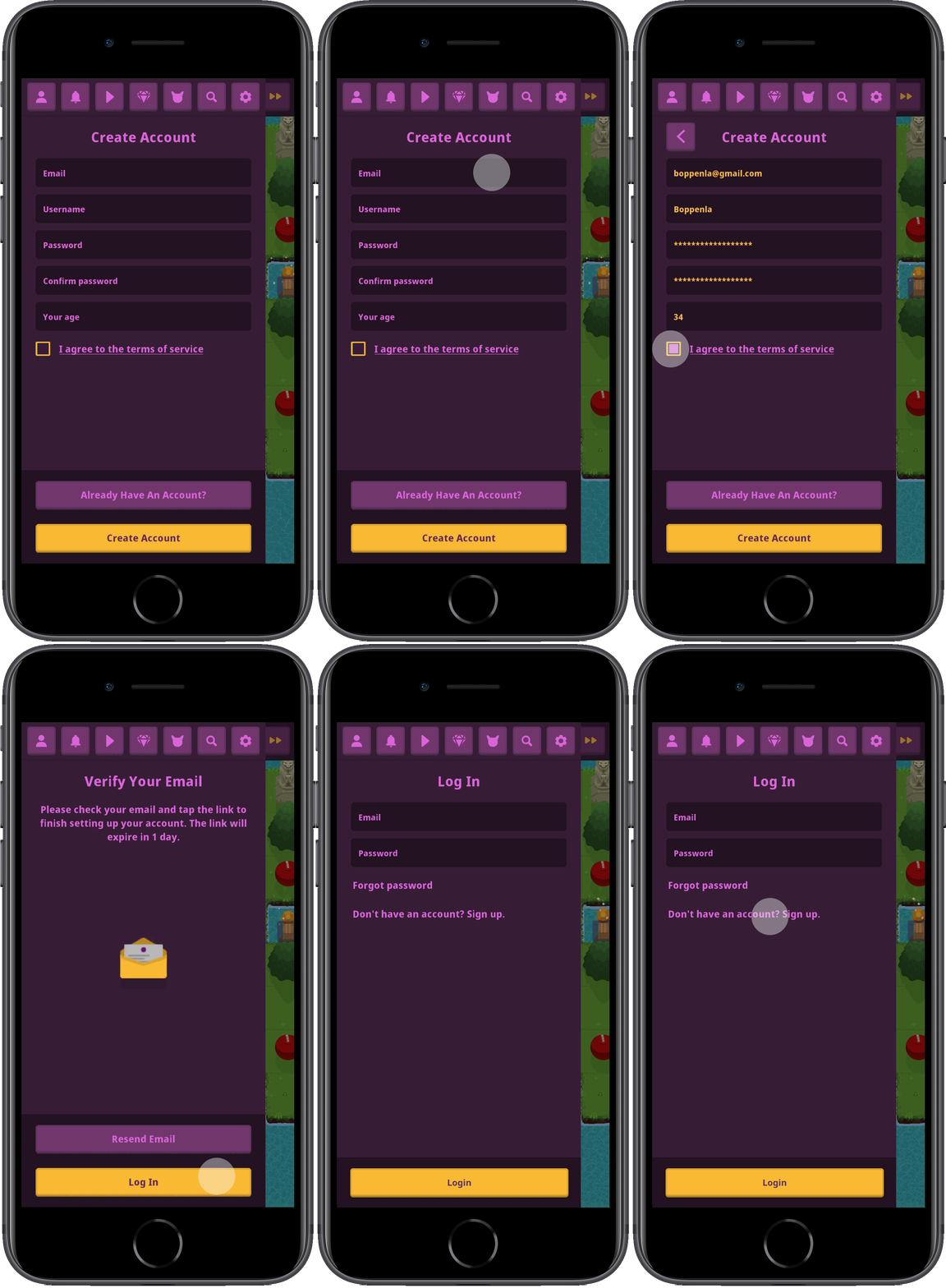
Encouraging players to create an account to save progress and unlock features helps segment and understand our most engaged users. Using a clickable prototype in Sketch, I conducted in-person user tests to observe interactions with tasks like "Update your password," which revealed opportunities for design improvements.
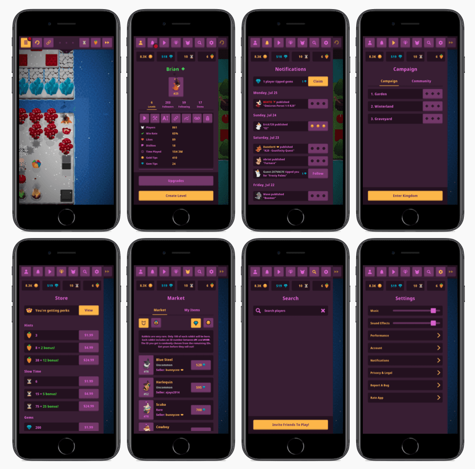
Pullout Navigation
Through multiple iterations of rapid wireframing and prototyping, I chose a pullout navigation scheme. This allowed players to quickly and easily navigate the game from any point. The decision aligned with our continuity goal—maintaining player flow by enabling seamless navigation. I was inspired by Twitter’s pullout navigation, a useful pattern for keeping users oriented without breaking the flow.
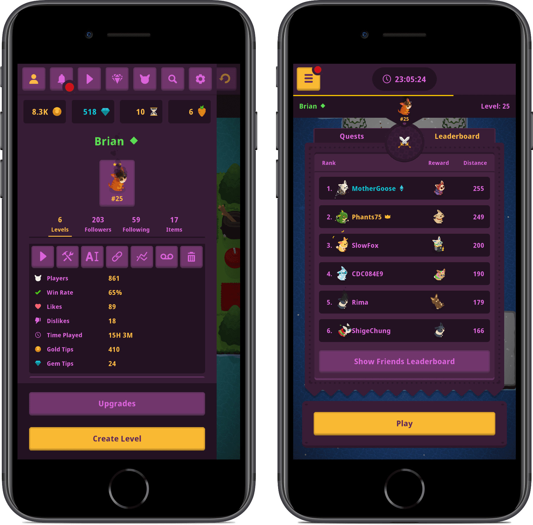
Player Profiles
A sense of progress is a powerful motivator, encouraging players to return and achieve more. As players invest in their progress, they not only feel a sense of accomplishment but also perceive their account as more valuable. King Rabbit offers several ways for players to experience progression, such as through followers, items, currency, levels built, and leaderboards.
Notifications
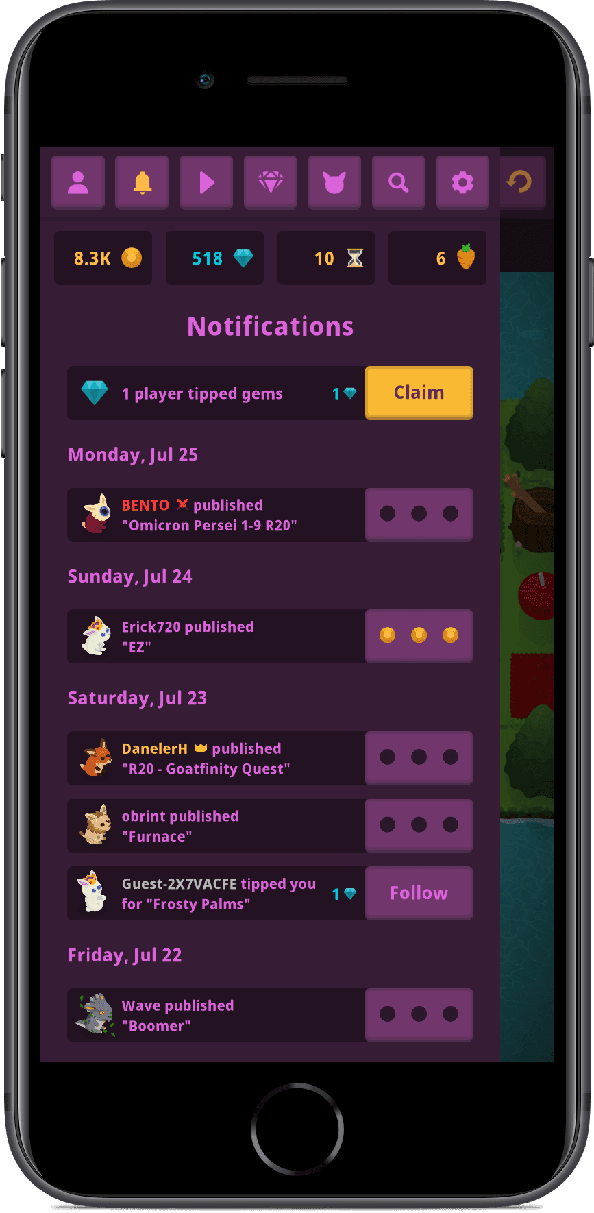
With the introduction of new market and community features, it became essential to keep players informed about the game’s status. Transparency was key—players needed to know when they sold an item, when a new level was released, or when they moved up the leaderboard. We added a minimalistic activity feed, which players could manage through their settings. This also provided a channel for us to communicate updates and sales, subtly guiding users without overwhelming them.
Style Guide Library
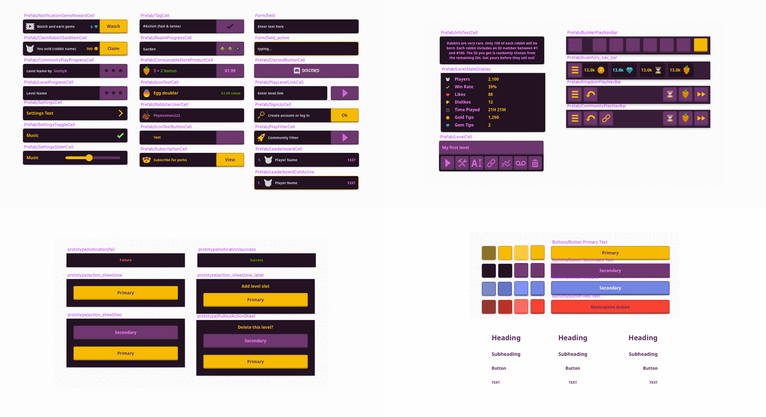
To maintain consistency and reusability, I built a comprehensive style guide and library of reusable assets in Sketch. This included button styles, text styles, icons, colors, and prefab components. The use of symbols ensured that small visual tweaks could be easily propagated across all design mockups.
In Unity, we created prefabs that mirrored the components in Sketch, maintaining a consistent naming structure. This streamlined the iteration process and saved time during development.
Note: we eventually moved everything to Figma for better plugin support, better color and variant tools, and asset management. However, drawing art assets with the pencil tool in Sketch still feels superior.
Visual Design
I'm always trying to make things pixel-perfect, especially UI elements. Creating art for the broader game meant stepping away from this perfectionism. All game assets were created in Sketch, an unconventional choice for game art, which was then featured in Wireframe Magazine (issue 59, page 66) and on the Sketch blog.
In the King Rabbit universe, we wanted players to feel the theme of royalty. Purple, associated with royalty, power, and wealth, was chosen as a secondary color. Gold was chosen as the primary color and in-game currency. This color scheme was chosen for readability and to reinforce the royal theme throughout the game.
Final Games
Reflections
Don't give your players whiplash: The evolution of our monetization strategy had a significant impact on UI design. Over time, as App Store trends shifted, we felt we had to adapt our monetization strategies. These changes sometimes led to user frustration, as players didn’t always appreciate changes in monetization strategies.
Work with constraints: With limited resources—a single designer and engineer—creating complex interactions was often tempting but impractical. By embracing constraints and prioritizing core goals, we were able to keep the design light and efficient, focusing on what truly mattered.


